

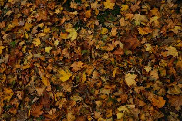
The most memorable fall weddings rarely rely on orange alone. They borrow from the season’s changing light: the muted green of an olive branch, the richness of a burgundy dahlia, or the softness of cream linen beside a wooden table. The best fall wedding color palettes feel warm and intentional, without making every detail look like a harvest display.
Start with the atmosphere you want guests to experience, then choose colors that can work across flowers, tables, attire, and paper goods. These autumn combinations offer distinct moods, from relaxed countryside gatherings to candlelit formal celebrations.
How to Choose Fall Wedding Colors That Work Together
A useful starting point is three colors: one dominant shade, one supporting color, and one accent. The dominant shade might cover tablecloths or larger floral arrangements; the supporting shade can appear in bridesmaid dresses and napkins; the accent belongs in smaller details such as ribbons, menus, or candles.
Think about your venue before ordering anything. A barn with honey-colored timber already supplies warmth, while a white gallery gives deeper colors room to stand out. For an outdoor ceremony, inspect fabric swatches in daylight. For an evening reception, check them under warm bulbs or candlelight, where dark burgundy and plum may appear almost black.
Six Fall Wedding Color Palettes Worth Considering
1. Terracotta, Sage, and Ivory
This earthy combination suits garden venues, rustic estates, and relaxed outdoor receptions. Terracotta brings the autumn warmth; sage keeps it fresh; ivory prevents the overall look from becoming heavy. Try rust-colored dahlias or roses mixed with soft greenery and cream blooms. On tables, pair ivory cloths with sage napkins and terracotta-colored bud vases. A terracotta ribbon around simple ivory invitations can carry the same feeling without repeating every shade everywhere.
2. Burgundy, Dusty Rose, and Champagne
For a romantic wedding that feels sophisticated rather than overly dark, layer rich burgundy with muted pink and champagne. Burgundy bouquets look especially striking against neutral dresses, while dusty rose softens the floral arrangements. Champagne-colored runners or subtle metallic details add warmth without the glare of bright gold. This autumn wedding palette works beautifully in ballrooms and historic houses, where polished glassware and soft candlelight suit its elegance.
3. Burnt Orange, Mustard, and Forest Green
This is a confident choice for couples who love the changing leaves. Forest green provides an anchor so the two warm colors do not compete. Use green table linens, mustard napkins, and occasional burnt-orange flowers instead of placing all three colors in equal amounts. For attire, deep green suits or dresses can be more versatile than full orange outfits. Keep stationery on cream stock with one warm-colored illustration for a cleaner result.
4. Emerald, Plum, and Antique Gold
Jewel tone wedding colors create depth at an autumn evening celebration. Emerald velvet, plum florals, and brushed gold details make a particularly effective combination in spaces with dark wood or dramatic lighting. Let the flowers blend plum with lighter mauve or cream so bouquets retain definition in photographs. Antique gold belongs in small touches such as flatware, frames, and wax-seal effects, not every surface. The result should feel layered, not theatrical.
5. Rust, Dusty Blue, and Warm Cream
Not every seasonal palette needs to look traditionally autumnal. Dusty blue cools the intensity of rust and makes the scheme feel airy, particularly for a September or early October wedding. Picture cream table linens, blue napkins, and centerpieces featuring rust-toned flowers with pale accents. Blue invitations with rust envelopes also establish a pleasing contrast. This is a smart option when the venue has stone walls, pale wood, or views of an open landscape.
6. Olive, Chocolate Brown, and Oatmeal
Earthy wedding colors can be understated and still feel special. Olive greenery, chocolate-brown ribbon, and oatmeal fabric form a quiet, textural palette that suits intimate dinners and modern minimalist venues. Rather than relying on bold blooms, explore layered foliage, cream flowers, and varied materials such as linen, ceramic, and wood. Chocolate-brown suits or accessories can echo the tables without asking everyone in the wedding party to match exactly.
Translate Your Palette Into Actual Wedding Details
Flowers: Balance Color With Shape
Give your florist a palette and a mood, not a rigid list of exact flowers. Dahlias, chrysanthemums, roses, seasonal foliage, and textured branches can suit fall arrangements, but local availability varies by region and date. Ask for a mix of large focal blooms, smaller supporting flowers, and greenery. When choosing burgundy or plum, include a lighter blossom so the arrangement does not read as one dark mass from a distance.
Tables: Let One Element Take the Lead
A common mistake is using the accent color on every napkin, plate, candle, and flower. Choose one major surface, such as a tablecloth or runner, to carry the dominant color. Then repeat the accent sparingly. For example, at a 10-person dinner table, ivory linen and sage napkins could be paired with three small terracotta-toned arrangements. Guests see a coordinated setting, but the place settings remain easy to read and the flowers do not block conversation.
Attire: Coordinate Instead of Copying
Bridesmaid dresses do not need to match the flowers perfectly. In fact, contrasting shades usually photograph with more depth. Burgundy bouquets against champagne dresses, or rust bouquets against sage dresses, make both elements visible. For suits, charcoal, brown, navy, and deep green can complement many fall wedding colors. Look at the whole wedding party together before committing to one fabric color, especially if the ceremony and reception have different lighting.
Stationery: Introduce the Feeling Early
Invitations are an opportunity to signal your palette before guests arrive. A cream invitation with olive typography and a rust envelope can feel more refined than printing every color across the page. Carry one or two elements into place cards, welcome signs, and menus. For more inspiration, consider wedding invitation design ideas alongside fall wedding centerpiece ideas and seasonal wedding flower arrangements.
Frequently Asked Questions
What are the most popular colors for a fall wedding?
Burgundy, rust, terracotta, forest green, and warm neutrals are classic choices. Popularity matters less than choosing shades that complement your venue, season, and personal style.
Can fall wedding palettes include blue?
Absolutely. Dusty blue looks especially balanced beside rust, cream, or copper. It can lighten an autumn scheme without making the celebration feel summery.
How many colors should a wedding palette have?
Three core shades are usually manageable: a dominant color, a secondary shade, and an accent. Neutral materials and natural greenery can add depth without becoming additional competing colors.
Should flowers match bridesmaid dresses?
No. Contrast often looks better. Choose flowers that share the broader palette, then use lighter or darker tones to help bouquets stand out against the dresses.
Bring the Season Into Focus
A successful fall wedding palette does not need every autumn color at once. Choose a combination that suits the space, decide where each shade will appear, and let flowers, fabrics, lighting, and small details carry the story. The result feels seasonal because the pieces belong together, not because everything matches.
